
.
So when promoting books, 'sizzle' becomes important. An approach that can be adapted to a wider range of authors or titles, so when Book X is borrowed, there are other options around.
.
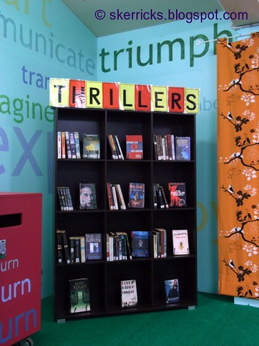
I've been experimenting with 'sizzle marketing' this year. One of the recent experiments was Thrillers. Narrowly defined, Thrillers could just mean Ludlumish books. I went hunting for definitions of thrillers, and burgled out the bits I liked, deciding that Thrillers were books with thrills/excitement/adventure, and by gosh and by golly,what school library doesn't have books falling within these generous parameters?
.
Using a thrilling colour scheme of yellow and red, (easily found in standard school cardboard) we had a header on our foyer bookcase:
.
.
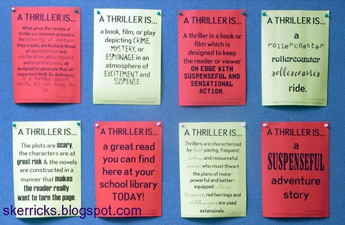
...and extracts from the quotes I found on the noticeboard behind the borrowing desk:
.
.
And bookmarks based on these quotes, using yellow and red cardboard. I also had a plan for a banner, but time and other commitments defeated that plan, this time round.
.
There wasn't an especial spike in lending, but the purpose of this isn't the spike anyway. We had something else on the noticeboard/bookcase/bookmarks before this, and something else after, and the regular changing of the guard on these is a signal that our library is a place where things are evolving, not static, where there's something new to see, something new to find or discover. Subliminal sizzle, as well as more overt marketing.
.
What do you need?
The yellow and red cardboard are standard school colours, nothing special. Some of the more unusual fonts came from Scrapvillage. The quotes (formatting is my own) from assorted googling. Bookmarks were my usual 2x4 grid using Microsoft Publisher. If you're on the nswtl email list, I sent a copy of the file for the bookmarks and the file for the posters (with my school name removed) to the list a week or two ago. The bookcase header letters are laminated, and behind them you'll find nothing fancier than a metal bookend.
.
Cheers, Ruth
.
What are your ideas for marketing the sizzle? Do leave a comment!
.
*GIFSL = Good ideas for school libraries
.


2 comments:
Hi Ruth
Great design!
We did a similar 'thematic' sizzle display recently. As I work at a girls' school we focused on 'Tearjerkers' and had a display of photos of teachers pretending to cry while reading their favourite tearjerker novel (usually with props such as a box of tissues). As well as this we had teardrops dangling from the display shelves.
The photos attracted a lot of attention and there was an increase in borrowing (anecdotal!) from this display as opposed to the regular 'new and interesting books' display.
I think I will try with love stories next. Any ideas?
Karen
Hello, Ruth. Great ideas, as usual. we have tried similar things using a bookcase and a theme for the fortnight. We then get a variety of books and fill the bookcase but do not really have the skill/time/talent to do the signage...still looking for a way around this!
I agree re the differences between us and booksellers. I have been buying multiple copies of some titles to combat this and it helps with more popular (sizzling?) titles.
Regards, Shane
Post a Comment