Ah, school holidays. If you believe the view of some, it's when teachers become lotus-eaters, lounging around on yet another long holiday. No, and not this little black duck. I am blessed with a lovely school assistant who offered to come in for a day too so we could get a start on the wall.
.
.
It takes longer than you might think to paint wall words. Consistent with the rest of the library - the purple wall downstairs, the aqua walls of the foyer - this was our plan all along. As I've probably said before, I like this idea, which I borrowed from a Robin Hood poverty-alleviating school library renovation in New York (I provided some links in
this blog entry), because the text is meaningful. Sure, we could paint a field of daisies or something, I guess (harder to do, I'd say as well). But this is a secondary school, and words carry meaning and convey messages and ideas, so this is what we've been doing for the last eighteen months, gradually, as time and money permit.
.
We figured we'd get about six larger-scale words up and painted, over the seven or so hours we had available (we were working in with the general assistants' hours and when the school alarms are off/on, and so forth). Maybe more, but we'd start with that goal. We plan to paint more, as time permits.
.
I've been asked how we do this, where to buy the stencils. You don't. It's low-tech, with equipment to hand in a school: photocopied transparencies (from printouts you've prepared yourself, I use Microsoft Publisher), an overhead projector, chalk. Like this.
.
.
Back at the start of our first wall, I chose a font to be our 'library' font, and it's the one we've used on all the walls. I'd recommend a sans serif one (less fiddly bits). I chose one that's modern, but with the odd vintage allusion in the shape of a few letters, because I like it. I do all the library paperwork/signage in this font.
.
The choice of our words is something to which much thought has been given. It's an important part of the process, to think about the messages you wish to convey about the library's purpose; and the choice of words so it's accessible and inspiring to the kids, too.
.
I'm unlikely to post our master list (an evolving beastie) on this blog, for a couple of reasons: I don't want it taken by a commercial enterprise, so they can do vinyl words or other signage based on it - we've thought about it a great deal, as I'm sure you understand (so if you're a commercial enterprise, please don't). Secondly, if you're a TL, that process of coming up with your words is an invaluable journey for you in your renovation process. It's an expression of philosophy, intent, purpose, vision.
.
I had to decide on six words to paint in a large size, that would express my philosophy about the library. What would your six words be for your library?
.
Time for another picture?
.
.
A tip, from my school assistant, who is a painter. Make up a palette record, like this - it's just a bit of cardboard, with a decent coat of the background colour, and then a record of every paint colour you plan to use. It helps you see the possibilities and shows you how the paint colours look against the background (they can come up quite differently, one purple pot looked green on the first purple wall). We also record which colour we use for which word, so if we have to do a touch-up, we know the correct colour to use.
.
These are craft-shop folk art paints from Spotlight, some new colours plus the purples we have left from the first purple wall and the chartreuse-olives we have from the aqua foyer. The chips were a terrific beginning, the idea of going with oranges and chartreuse-olive on the purple, but we didn't need big cans of paint (and couldn't afford them). These pots and tubes are between four and about eight dollars each.
.
In terms of how to make each word fit, and where to put it, that's an individual decision. We sketched out a rough idea, but then it's trial and error, moving the OHP around, printing up another size transparency, fiddling and looking till you get the size on the wall that pleases your eye. We aren't signwriters or professional painters, (nor is the budget for that expertise available - this is done on a very small shoestring budget) (so that means we're not doing something you can't do, for lack of money - isn't that good?).
.
.
And then you paint. This wall involved greater challenges than the earlier ones - the paint sat differently on the doors to the bricks, and we had to chalk around the in and out of door frames. Once again, on the brick, we skipped over the grout: trying to paint in and out of this would be difficult and look pretty dicky/iffy, I think. This does mean, however, that you're doing a lot of edges. The foyer was mostly flat walls, so we had to get used to brick again. We are happy with the handpainted look of it - here, we haven't yet touched up the edges or washed off the chalk, but that's to come. Also, there is only one coat of purple around the red resource centre and we have not yet finished with that.
.
Enough of the explanations! Doesn't it look good? Positive comments welcome!
.
Remember, this is what it looked like towards the end of term 1.
.
.
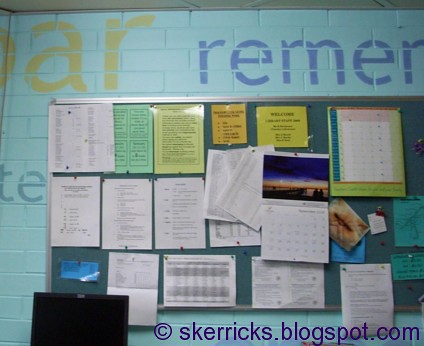
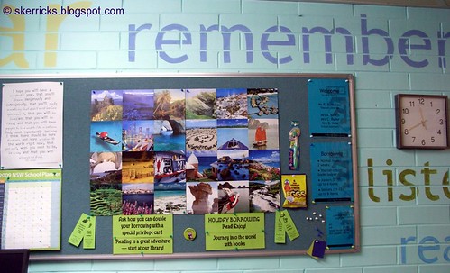
And now it looks better - more inviting, conveying a message about the library and its purpose, much more attractive. We are creating a positive and engaging learning environment, not just doing pretty for pretty's sake - and first impressions count.
.
.
Another view of our progress so far. This is where we got to by day's end. We have more to do, and it may take some months to get it done, but when the kids arrived back at school, the transformation had started. I'm so appreciative of my school assistant for giving up a day of her holidays.
.
One question people ask: what about when the kids graffiti on this? Well, they haven't done any graffiti on the other wall words; this is likely to be a bit less supervised. We'll paint over it, New York Police address the little before it gets big style. But the potential graffiti of a few kids sure isn't enough reason to say we oughta do nuffin.
.
I'll blog about this again when we've made more progress. But the library's easier to find, now. Even if people get told to look out for the purple wall. It's a start.
.
Cheers, Ruth
.
PS. Of course I brought in fudgy iced chocolate brownies, and invited the general assistants to join us for morning tea. Why do you ask?! I took home an empty, clean dish...
.
PPS: the airconditioner is for one room off the library: the main library areas are not airconditioned. Just in case you wondered.
.


